It’s a well-known fact that colour influences your mood. In the home, colour can be used in every aspect of the design and decoration. It’s almost impossible to understate how important a seemingly simple choice can be.
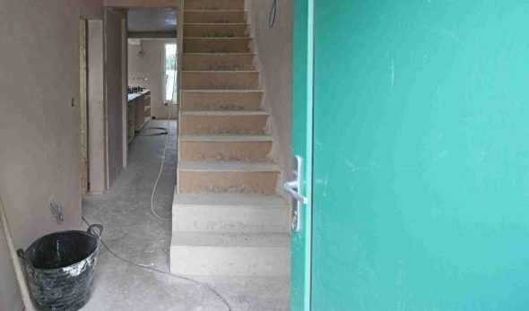
As an architecture practice, reaching the colour stage of a project is always a significant milestone. To us, it signifies that we’re nearing completion; our clients will be able to move into, what we hope, is their dream home soon. As for the client, this can often be the most ‘hands-on’, and dare we say it, enjoyable part of the project. It’s completely understandable. This is when the blank canvas – bare plaster, concrete floors, etc. can be injected with personality and all that time spent researching and collating Pinterest boards comes to fruition!
Colour provokes a psychic vibration. Colour hides a power still unknown but real, which acts on every part of the human body.
Wassily Kandinsky
It’s always fascinating to see the project come to life. We love working closely with the client and contractor to realise the vision. However, that’s not to say that some important colour decisions aren’t made before then. Let’s go back to the early stages of a project because some exciting colour choices can be made before construction has even started.
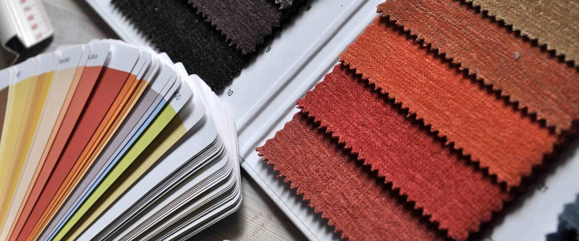
Colourful windows & doors to add kerb appeal
The windows and doors are a huge part of your project, not only in terms of budget but also for adding the finishing touch and that all-important kerb appeal. As people have started to move away from uPVC to sleeker alternatives we have noticed an increase in clients opting for colours outside of the standard Anthracite grey. In fact, for Paul’s own retrofit project he and his wife chose a green front door.
Green is always in fashion
Green Building Store, which has been supplying triple glazed timber windows and doors for 25+ years has noticed a few colour trends over the years. Chayley Collis, Green Building Store’s Communications Manager says: ‘When we first started ‘Dove blue’ and Lavender was very popular alongside forest green and occasionally pillar box red (for doors especially).’
Windows and doors from Green Building Store’s PERFORMANCE range
‘More recently the colour choices seem to be veering more to greys or greys with a hint of blue and green. Green is still popular, especially for traditional and older properties. Occasionally we do get requests for funky brighter colours such as orange, canary yellow or even purple.‘
Colourful windows and doors from Green Building Store’s PERFORMANCE range
Top Tip:
If you’re thinking of using a bold or unusual colour for your windows and doors, we would always recommend referring to a RAL* chart to double-check it’s the right colour for you.
Find out more about Green Building Store and its PERFORMANCE range here: https://www.greenbuildingstore.co.uk/performance-triple-glazed-windows-and-doors/
*RAL colours are used across architecture and construction for defining standard colours across all finishes. So, if you’re embarking on a project be prepared to become very familiar with them. Click here to see a RAL chart: https://www.ralcolorchart.com/ral-classic
Colour can make your home warmer
The colours in your home can not only influence your mood but also whether you feel warm or cold. A study conducted by Oxford University with the paint brand Valspar found that colour can indeed affect how you judge temperature. After being in different coloured rooms (all set to the same temperature) participants thought that an olive green room was warmer than others.
Top tip:
As a practice, we also focus on warm and cold tones in finishes, as well as paint. For example, we often recommend wood skirting boards rather than standard white MDF. You’d be surprised at how much warmth they can add to a space.
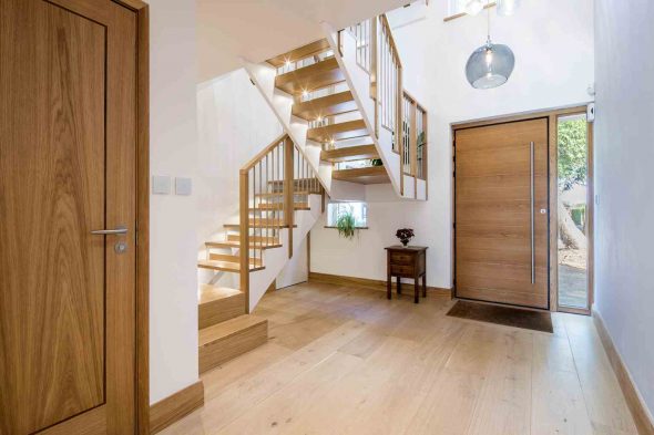
At our Stamford Road project, we incorporated wood finishes, from skirting boards to balustrades, to complement the neutral palette and add warmth
The heart of the home
We couldn’t talk about the home without mentioning the kitchen, which, according to a recent survey by Money Supermarket is the most popular room to renovate among homeowners in the UK.
We asked Olly Leyland, Senior Designer, at Sheffield Sustainable Kitchens to share his top tips for adding colour to your kitchen.
‘The colour scheme you choose for your kitchen defines its personality, so it’s worth giving some serious thought to, as you’ll be enjoying it for years to come. You may want to pick different tones from a colour palette for a calm and harmonious effect, or you may favour a bolder, more contrasting statement. We’ve seen a lot of greys and dark blues recently, which can create a dramatic space and set the mood for living and entertaining, not just cooking.’
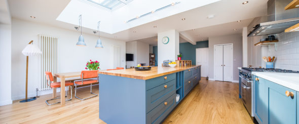
A kitchen by Sheffield Sustainable Kitchens with cabinets painted in Farrow & Ball’s Downpipe, which contrast beautifully with the white kitchen elements and the warmth of the solid oak top of the kitchen island
However, you might prefer to keep the core of your kitchen and incorporate colour in other ways. ‘You can keep your kitchen light and neutral overall, says Olly. ‘Introduce small splashes of colour in different ways. For example, on a feature wall or splashback or in a statement worktop. Some of our clients opt for a bright recycled glass worktop to lift a more muted kitchen space.’
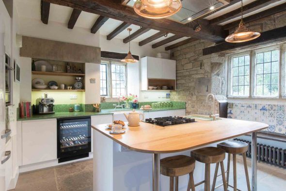
A bespoke green toughened recycled glass worktop made from crushed bottle glass set into a coloured resin mould adds an interesting detail
Top Tip:
When planning your kitchen’s colour scheme, it’s vital to consider:
- The size of the room
- Your choice of raw materials
- And the lighting, as all of these will impact on the effect you are trying to achieve
Read more about designing your kitchen
Related
6 tips for creating a sustainable kitchen
We’re pleased to have teamed up with Sheffield Sustainable Kitchens to share their top tips for creating your own sustainable kitchen.
Find out more about Sheffield Sustainable Kitchens here: https://ssk.uk.com
Inspiration from nature
In his book Colour Now, Kevin McCloud refers to ‘bringing the outside in’ as ‘one of the greatest modern architectural obsessions’. Well, with good reason, Kevin. Why wouldn’t you want to incorporate the many benefits nature has on our health and wellbeing into the home? It’s something we discuss in detail in our How to Create a Healthy Home blog.
The bespoke window seat at Sycamore Hall is the centrepiece of the open plan living area
Top Tip:
If you want to make the most of your outside surroundings focus on keeping things simple inside. For example, if you’ve invested in big windows, look for colours that would complement, rather than compete, with the views.
This article by Homebuilding & Renovating magazine has some more design ideas for dissolving the boundaries between the inside and outside.
Paint
Speaking of a healthy home, it’s worth considering the ingredients of your paint and not just the colour. It’s common knowledge that paint contains a whole concoction of chemicals and that there’s a lot more to what it says on the tin. Did you know that the paint chemicals can actually remain active for up to five years after your paintbrush has dried out?
More people seem to be looking for healthier paint options, and we’ve noticed some exciting new ranges.
Edward Bulmer Natural Paint has gone against the grain and list all ingredients in their paints, which are made from naturally occurring raw materials of plant origin like linseed oil, or from mineral raw materials such as chalk, earth and mineral pigments.
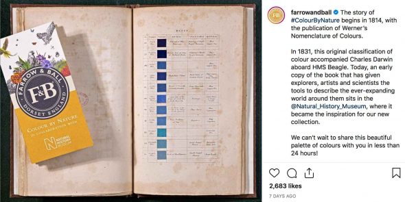
Farrow & Ball has just launched a collaboration with the Natural History Museum of 16 paint colours inspired by nature. The range has been made from an eco-friendly water base in fully recyclable tins.
‘Who told you that one paints with colours? One makes use of colours, but one paints with emotions.’ – Jean-Baptiste-Simeon Chardin
Finalising the colour palette for your home
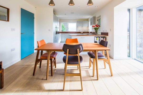
Terry Huggett, Managing Director of Terry Huggett Developments has many years’ experience working on residential projects. When he’s working on a project with a client, Terry uses the architecture as a starting point. ‘I keep it simple and relatable to the architecture. When done correctly, the natural light and spaces will help determine functionality and have a strong bearing on the colour palette. For example, if the architecture has a white render with a combination of timber cladding and grey windows, I would bring those elements to the interior.’
We worked with Terry Huggett Developments on our Cortworth Road project
Terry, himself, favours a modern and minimalist aesthetic. ‘My favourite way of incorporating colour into a room is with polished plaster and a concrete finish.’ In his own home, Terry has opted to introduce pops of bold colour through art and furniture. This also means it’s easier to update pieces.
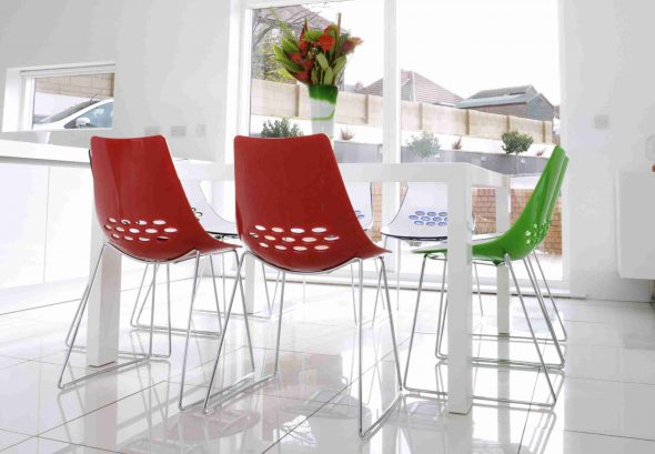
Terry Huggett’s Jam chairs by Calligaris are bold and punchy in colour but very affordable
Top Tip:
If possible, we would recommend asking your contractor to do the decorating as well as the build. They will be familiar with the interior and will be able to spot any marks or defects in the plaster before decorating. If you’re looking for a contractor, Terry recommends doing your homework first. ‘Speak to current clients and even professionals they have worked with. Visit a few projects to get a feel for the craftsmanship. Lastly, meet the rest of the building team to see their approach towards building your dream home.’
If any of these ideas have sparked your imagination let us know. We’d love to see your creative uses of colour in your own home.